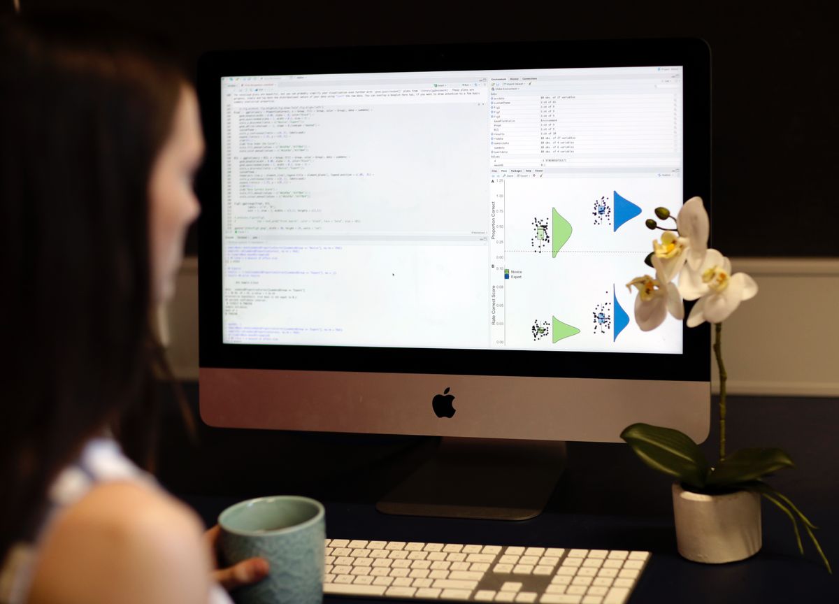
Data visualisation examples from research

Data Visualisation

Beautiful, transparent visualisations that communicate research clearly. From publication figures to stakeholder infographics.

Scroll to explore
01 — APPROACH

Visualisation Philosophy

Data points icon

Individual Points

Show every participant, not just averages. Each dot is a person.

Distribution icon

Distributions

Use density plots to reveal the shape behind summary statistics.

Error bars icon

Uncertainty

Always include error bars or confidence intervals.

Linked data icon

Paired Data

Connect matched observations to reveal hidden patterns.

02 — RESEARCH FIGURES

Research Visualisations

Publication-ready figures with reproducible R code. Click "View R Code" to see heavily commented code you can adapt for your own data.

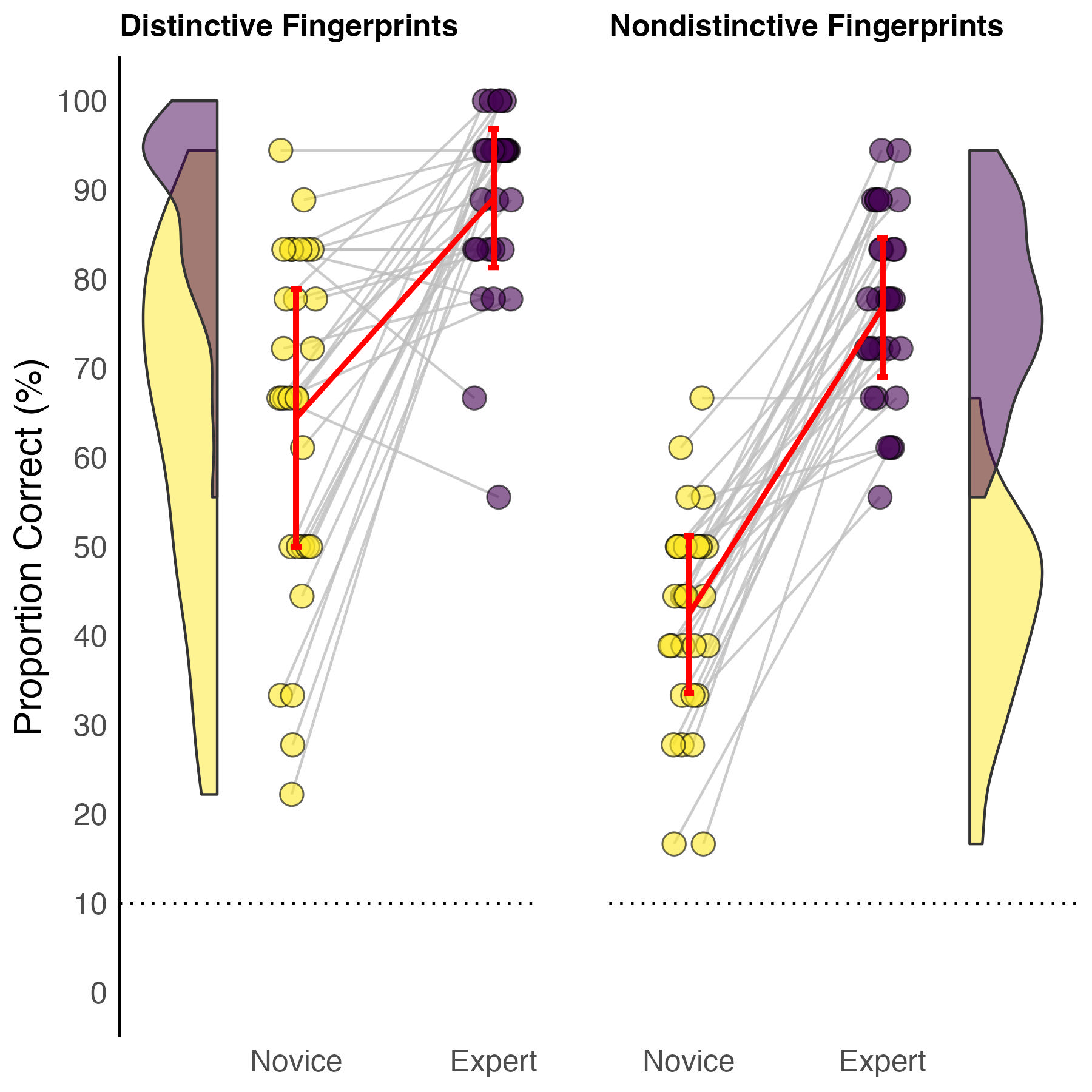
Raincloud plot showing novice vs expert performance

Paired Raincloud Plot

Combines density distributions on the sides, individual data points, connected paired observations (grey lines showing each participant's change), and group means with error bars. Perfect for showing within-subject changes between conditions.

Paired Comparison
View R Code
# ============================================================
# RAINCLOUD PLOT - Group Comparison Visualisation
# ============================================================
# This code creates a "raincloud plot" which combines:
#   - A density distribution (shows the shape of your data)
#   - A box plot (shows median, quartiles, outliers)
#   - Individual data points (shows every participant)
#
# WHAT YOU NEED TO CHANGE:
#   1. Replace 'your_data.csv' with your file name
#   2. Replace 'group' with your grouping variable name
#   3. Replace 'score' with your outcome variable name
#   4. Adjust colours to match your preferences
# ============================================================

# Load required packages
# If you don't have these, run: install.packages(c("ggplot2", "ggdist", "dplyr"))
library(ggplot2)
library(ggdist)
library(dplyr)

# ------------------------------------------------------------
# STEP 1: Load your data
# ------------------------------------------------------------
# Your CSV should have columns for:
#   - A grouping variable (e.g., "Control" vs "Treatment")
#   - A numeric outcome variable (e.g., test scores)

data <- read.csv("your_data.csv")

# Quick check: see first few rows of your data
head(data)

# ------------------------------------------------------------
# STEP 2: Define your colours
# ------------------------------------------------------------
# Change these hex codes to match your preferred colours
# Tip: Use https://coolors.co to find nice colour combinations

group_colours <- c(
  "Control" = "#92A4D2",    # Soft blue for control group
  "Treatment" = "#75352D"  # Rust for treatment group
)

# ------------------------------------------------------------
# STEP 3: Create the raincloud plot
# ------------------------------------------------------------

raincloud_plot <- ggplot(data, aes(
  x = group,           # CHANGE: your grouping variable
  y = score,           # CHANGE: your outcome variable
  fill = group,        # Colours by group
  colour = group       # Outline colours by group
)) +
  
  # --- The "cloud" (density distribution) ---
  # This shows the shape of your data distribution
  stat_halfeye(
    adjust = 0.5,           # Smoothness of the density curve
    width = 0.6,            # Width of the density "cloud"
    justification = -0.2,   # Position (negative = above the boxplot)
    .width = 0,             # Don't show interval lines
    point_colour = NA       # Don't show point estimate
  ) +
  
  # --- The box plot ---
  # Shows median, interquartile range, and outliers
  geom_boxplot(
    width = 0.15,           # Width of the box
    outlier.shape = NA,     # Hide outliers (we show all points anyway)
    alpha = 0.5             # Transparency (0 = invisible, 1 = solid)
  ) +
  
  # --- The "rain" (individual data points) ---
  # Each dot represents one participant
  geom_jitter(
    width = 0.05,           # Horizontal spread of points
    alpha = 0.6,            # Transparency of points
    size = 2               # Size of points
  ) +
  
  # --- Apply your colours ---
  scale_fill_manual(values = group_colours) +
  scale_colour_manual(values = group_colours) +
  
  # --- Labels ---
  # CHANGE these to match your study
  labs(
    title = "Comparison of Scores by Group",
    subtitle = "Each dot represents one participant",
    x = "Group",
    y = "Score",
    caption = "Visualisation shows density, boxplot, and individual data points"
  ) +
  
  # --- Clean theme ---
  theme_minimal(base_size = 14) +
  theme(
    legend.position = "none",              # Hide legend (groups are on x-axis)
    panel.grid.major.x = element_blank(), # Remove vertical grid lines
    plot.title = element_text(face = "bold")
  )

# --- Display the plot ---
print(raincloud_plot)

# ------------------------------------------------------------
# STEP 4: Save the plot
# ------------------------------------------------------------
# Adjust width, height, and dpi for your needs
# dpi = 300 is good for publications

ggsave(
  "raincloud_plot.png",
  plot = raincloud_plot,
  width = 8,
  height = 6,
  dpi = 300
)
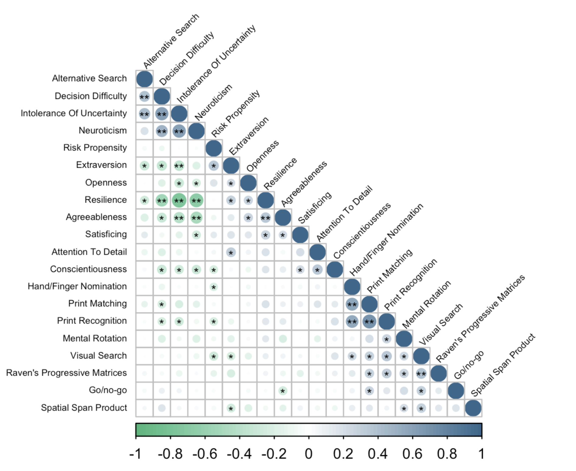
Correlation matrix showing relationships between cognitive variables

Correlation Matrix

Visualise relationships between multiple variables at once. Circle size indicates correlation strength, colour shows direction (green = negative, blue = positive), and asterisks mark statistical significance.

Relationships
View R Code
# ============================================================
# CORRELATION HEATMAP - Visualise Variable Relationships
# ============================================================
# This creates a colour-coded matrix showing correlations
# between all pairs of numeric variables in your dataset.
#
# WHAT YOU NEED TO CHANGE:
#   1. Replace 'your_data.csv' with your file name
#   2. Select which columns to include in the correlation
#   3. Adjust colours if desired
# ============================================================

# Load required packages
library(ggplot2)
library(dplyr)
library(tidyr)
library(corrr)      # Makes correlation matrices easy

# ------------------------------------------------------------
# STEP 1: Load and prepare your data
# ------------------------------------------------------------

data <- read.csv("your_data.csv")

# Select only the numeric columns you want to correlate
# CHANGE: list the column names you want to include
numeric_vars <- data %>%
  select(
    variable_1,    # CHANGE: your variable names
    variable_2,
    variable_3,
    variable_4,
    variable_5
  )

# ------------------------------------------------------------
# STEP 2: Calculate correlations
# ------------------------------------------------------------

# Create correlation matrix
# method options: "pearson" (default), "spearman", "kendall"
cor_matrix <- numeric_vars %>%
  correlate(method = "pearson") %>%
  shave()  # Remove upper triangle (redundant)

# Convert to long format for ggplot
cor_long <- cor_matrix %>%
  pivot_longer(
    cols = -term,
    names_to = "variable",
    values_to = "correlation"
  ) %>%
  filter(!is.na(correlation))  # Remove NA values

# ------------------------------------------------------------
# STEP 3: Create the heatmap
# ------------------------------------------------------------

heatmap_plot <- ggplot(cor_long, aes(
  x = term,
  y = variable,
  fill = correlation
)) +
  
  # --- The tiles ---
  geom_tile(colour = "white", linewidth = 0.5) +
  
  # --- Add correlation values as text ---
  geom_text(
    aes(label = round(correlation, 2)),
    colour = "white",
    size = 4,
    fontface = "bold"
  ) +
  
  # --- Colour scale ---
  # Blue = negative, White = zero, Red = positive
  scale_fill_gradient2(
    low = "#92A4D2",      # Negative correlations
    mid = "white",        # Zero correlation
    high = "#75352D",     # Positive correlations
    midpoint = 0,
    limits = c(-1, 1),
    name = "Correlation"
  ) +
  
  # --- Labels ---
  labs(
    title = "Correlation Matrix",
    subtitle = "Pearson correlations between study variables",
    x = "",
    y = ""
  ) +
  
  # --- Clean theme ---
  theme_minimal(base_size = 14) +
  theme(
    axis.text.x = element_text(angle = 45, hjust = 1),
    panel.grid = element_blank(),
    plot.title = element_text(face = "bold")
  ) +
  
  # --- Square tiles ---
  coord_fixed()

# --- Display the plot ---
print(heatmap_plot)

# ------------------------------------------------------------
# STEP 4: Save the plot
# ------------------------------------------------------------

ggsave(
  "correlation_heatmap.png",
  plot = heatmap_plot,
  width = 8,
  height = 7,
  dpi = 300
)
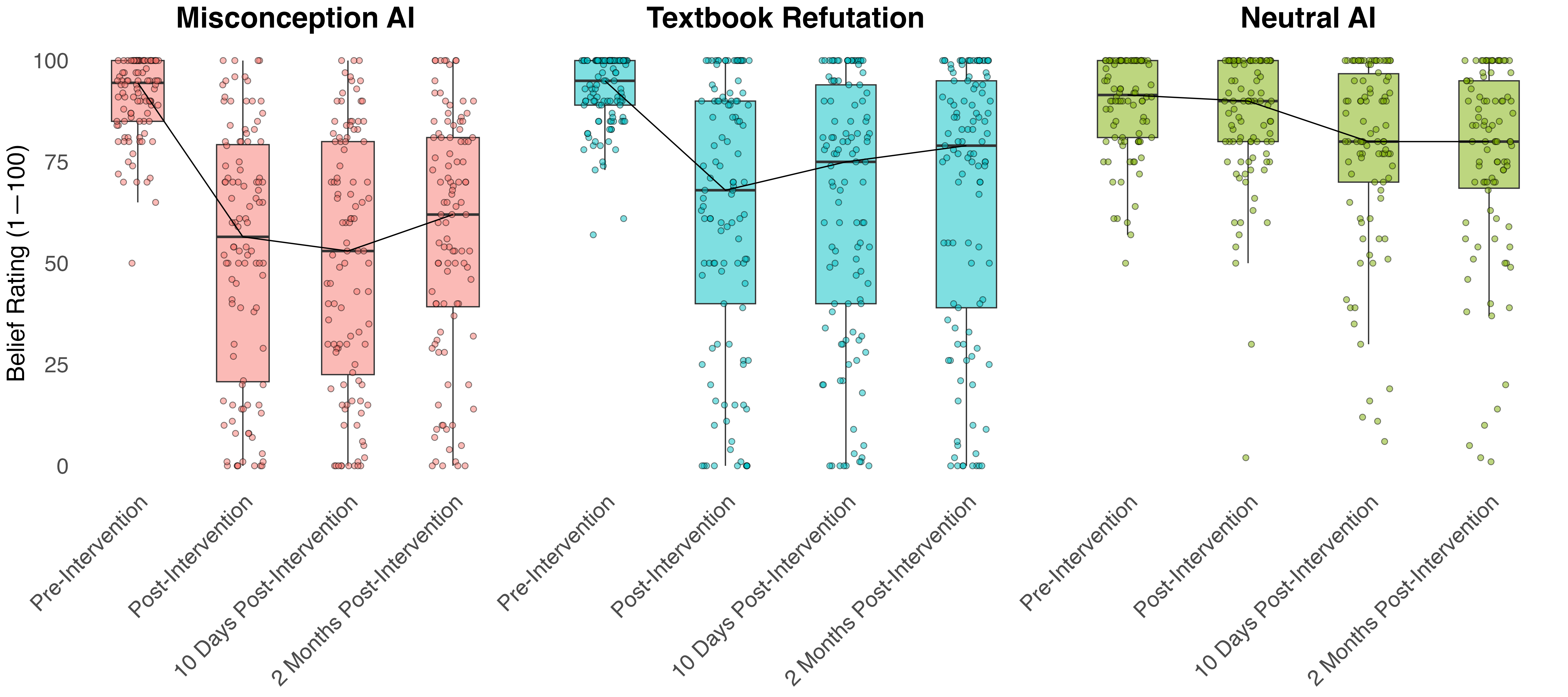
Longitudinal plot showing belief ratings across time points

Repeated Measures Plot

Track changes across multiple time points with box plots showing distributions, individual data points (jittered), and connected group means. Ideal for intervention studies with pre-post and follow-up measurements.

Time Series
View R Code
# ============================================================
# LONGITUDINAL TRAJECTORIES - Individual Change Over Time
# ============================================================
# This creates a "spaghetti plot" showing:
#   - Individual participant trajectories (thin lines)
#   - Group means with confidence intervals (thick line + ribbon)
#
# WHAT YOU NEED TO CHANGE:
#   1. Replace 'your_data.csv' with your file name
#   2. Replace variable names (participant_id, time, score, group)
#   3. Adjust colours to match your groups
# ============================================================

# Load required packages
library(ggplot2)
library(dplyr)

# ------------------------------------------------------------
# STEP 1: Load your data
# ------------------------------------------------------------
# Your data should be in LONG format with columns:
#   - participant_id: unique ID for each person
#   - time: time point (e.g., 1, 2, 3 or "Pre", "Post")
#   - score: your outcome measure
#   - group: grouping variable (optional)

data <- read.csv("your_data.csv")

# Check your data structure
head(data)

# ------------------------------------------------------------
# STEP 2: Calculate group summaries
# ------------------------------------------------------------

group_summary <- data %>%
  group_by(time, group) %>%  # CHANGE: your variable names
  summarise(
    mean_score = mean(score, na.rm = TRUE),
    se = sd(score, na.rm = TRUE) / sqrt(n()),
    lower = mean_score - 1.96 * se,  # 95% CI
    upper = mean_score + 1.96 * se,
    .groups = "drop"
  )

# ------------------------------------------------------------
# STEP 3: Define colours
# ------------------------------------------------------------

group_colours <- c(
  "Control" = "#92A4D2",
  "Treatment" = "#75352D"
)

# ------------------------------------------------------------
# STEP 4: Create the plot
# ------------------------------------------------------------

trajectory_plot <- ggplot() +
  
  # --- Individual trajectories (the "spaghetti") ---
  # Thin, semi-transparent lines for each participant
  geom_line(
    data = data,
    aes(
      x = time,              # CHANGE: your time variable
      y = score,             # CHANGE: your outcome variable
      group = participant_id, # CHANGE: your ID variable
      colour = group         # CHANGE: your grouping variable
    ),
    alpha = 0.3,             # Transparency (lower = more faded)
    linewidth = 0.5         # Line thickness
  ) +
  
  # --- Confidence ribbon for group means ---
  geom_ribbon(
    data = group_summary,
    aes(
      x = time,
      ymin = lower,
      ymax = upper,
      fill = group
    ),
    alpha = 0.2
  ) +
  
  # --- Group mean lines ---
  geom_line(
    data = group_summary,
    aes(
      x = time,
      y = mean_score,
      colour = group
    ),
    linewidth = 2
  ) +
  
  # --- Group mean points ---
  geom_point(
    data = group_summary,
    aes(
      x = time,
      y = mean_score,
      colour = group
    ),
    size = 4
  ) +
  
  # --- Apply colours ---
  scale_colour_manual(values = group_colours) +
  scale_fill_manual(values = group_colours) +
  
  # --- Labels ---
  labs(
    title = "Individual Trajectories Over Time",
    subtitle = "Thin lines = individuals, thick lines = group means with 95% CI",
    x = "Time Point",
    y = "Score",
    colour = "Group",
    fill = "Group"
  ) +
  
  # --- Clean theme ---
  theme_minimal(base_size = 14) +
  theme(
    legend.position = "bottom",
    panel.grid.minor = element_blank(),
    plot.title = element_text(face = "bold")
  )

# --- Display the plot ---
print(trajectory_plot)

# ------------------------------------------------------------
# STEP 5: Save the plot
# ------------------------------------------------------------

ggsave(
  "longitudinal_trajectories.png",
  plot = trajectory_plot,
  width = 10,
  height = 6,
  dpi = 300
)

Not Comfortable with R?

Use an LLM to help create these visualisations with your data

+

If you like these visualisation styles but aren't ready to dive into R code, you can use a large language model (like ChatGPT or Claude) to help create them with your data.

1
Screenshot the visualisation you want to recreate from this page
2
Prepare your de-identified data as a CSV file
3
Upload both to an LLM and ask it to write R code to create that visualisation with your data
Example Prompt
I want to create a raincloud plot that looks like this [screenshot]. My data has two groups (treatment and control) comparing test scores. Can you write R code to create this visualisation with my data? Please include comments explaining what each part does.

The LLM can also help you troubleshoot errors, adjust colours, modify labels, and adapt the code to your specific data structure.

Ethics Reminder: Only upload de-identified data. Never share private, confidential, or identifiable information with LLMs. Check with your ethics committee if you're unsure.
03 — STUDY DESIGN

Methods Diagrams

Clear visual explanations of research procedures, study designs, and data collection processes.
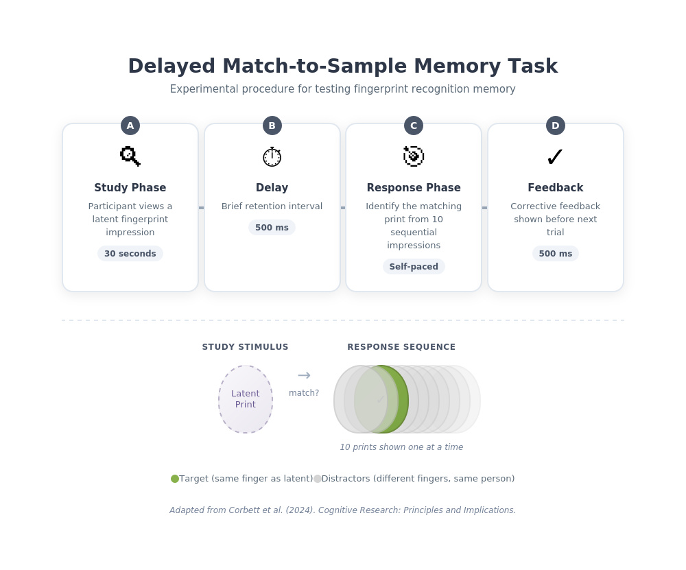
Delayed match-to-sample memory task procedure

Procedure Timeline

Delayed match-to-sample memory task for fingerprint recognition

Experimental Task
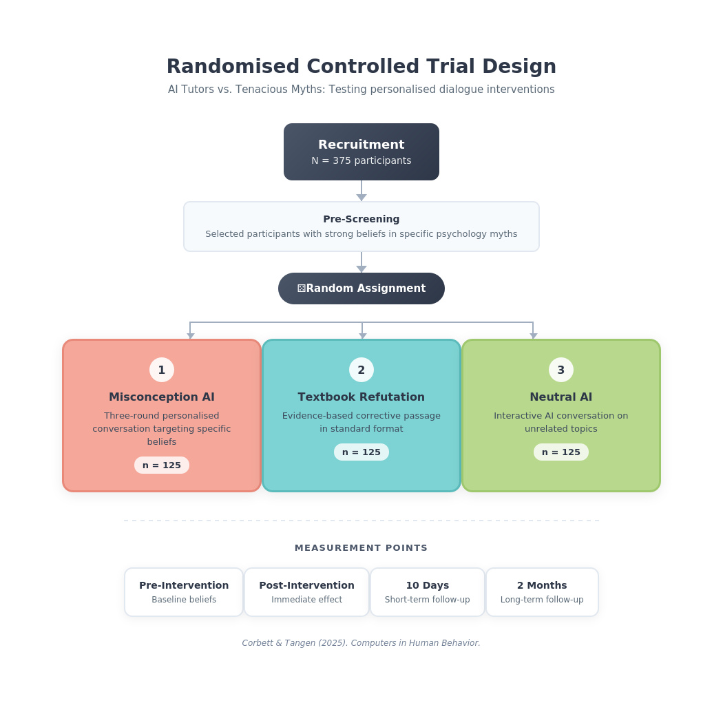
Randomised controlled trial design

RCT Design

Randomised controlled trial with three conditions and longitudinal follow-up

Study Design
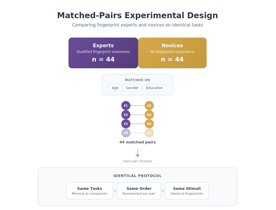
Matched-pairs experimental design

Matched-Pairs Design

Expert-novice comparison with matched controls on age, gender, and education

Experimental Design
04 — COMMUNICATION

Research Infographics

Transforming complex research findings into clear, engaging visual summaries for broader audiences.
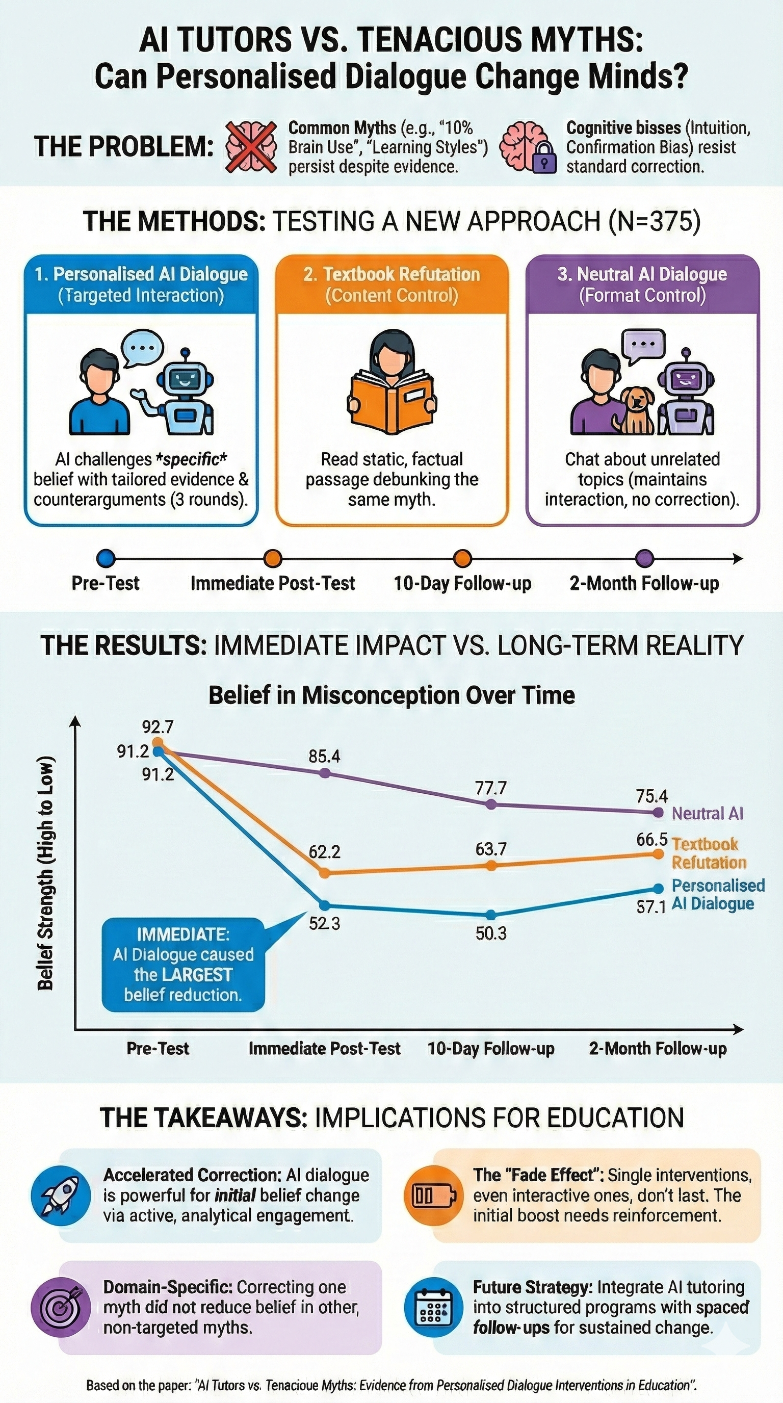
Created with Nano Banana Pro
AI Tutors vs Tenacious Myths infographic

AI Tutors vs. Tenacious Myths

Can personalised AI dialogue change minds about persistent educational misconceptions?
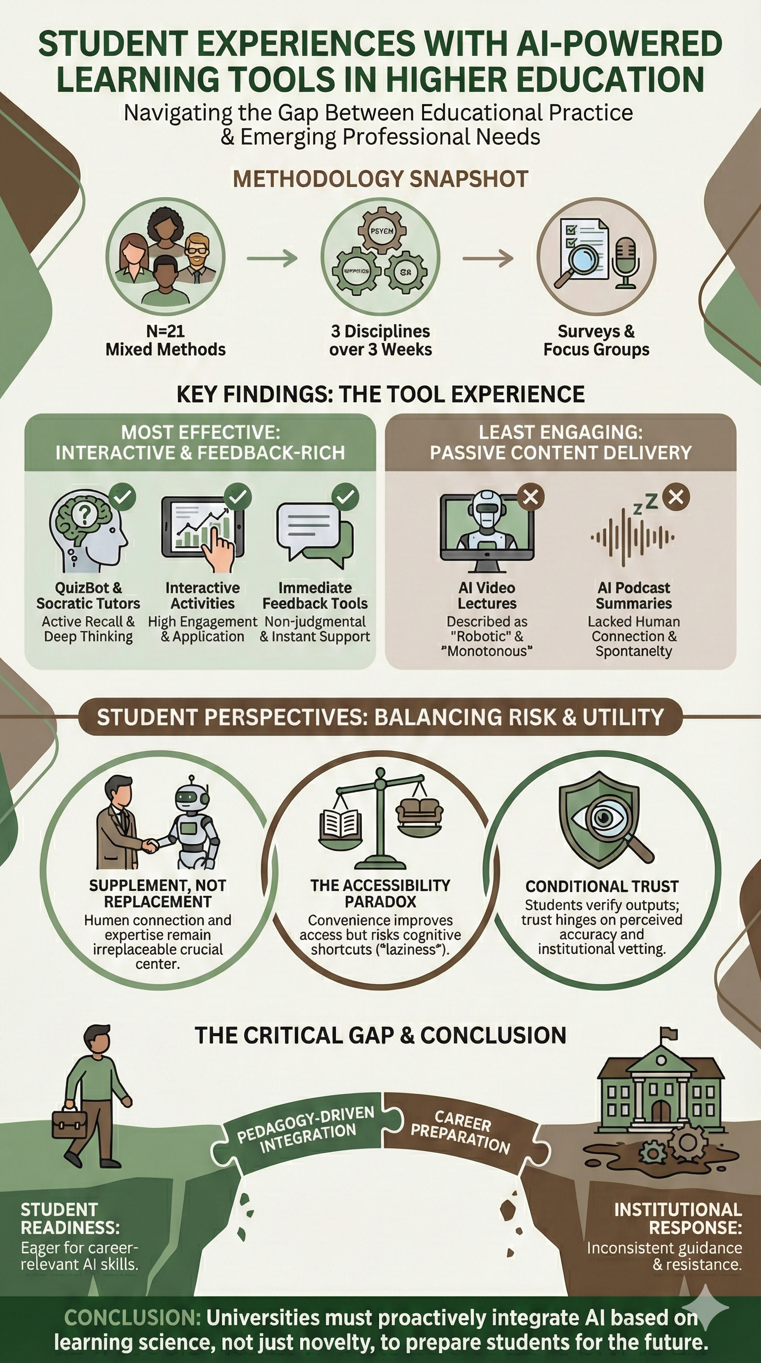
Student Experiences with AI Learning Tools infographic

Student Experiences with AI Tools

Navigating the gap between educational practice and emerging professional needs.
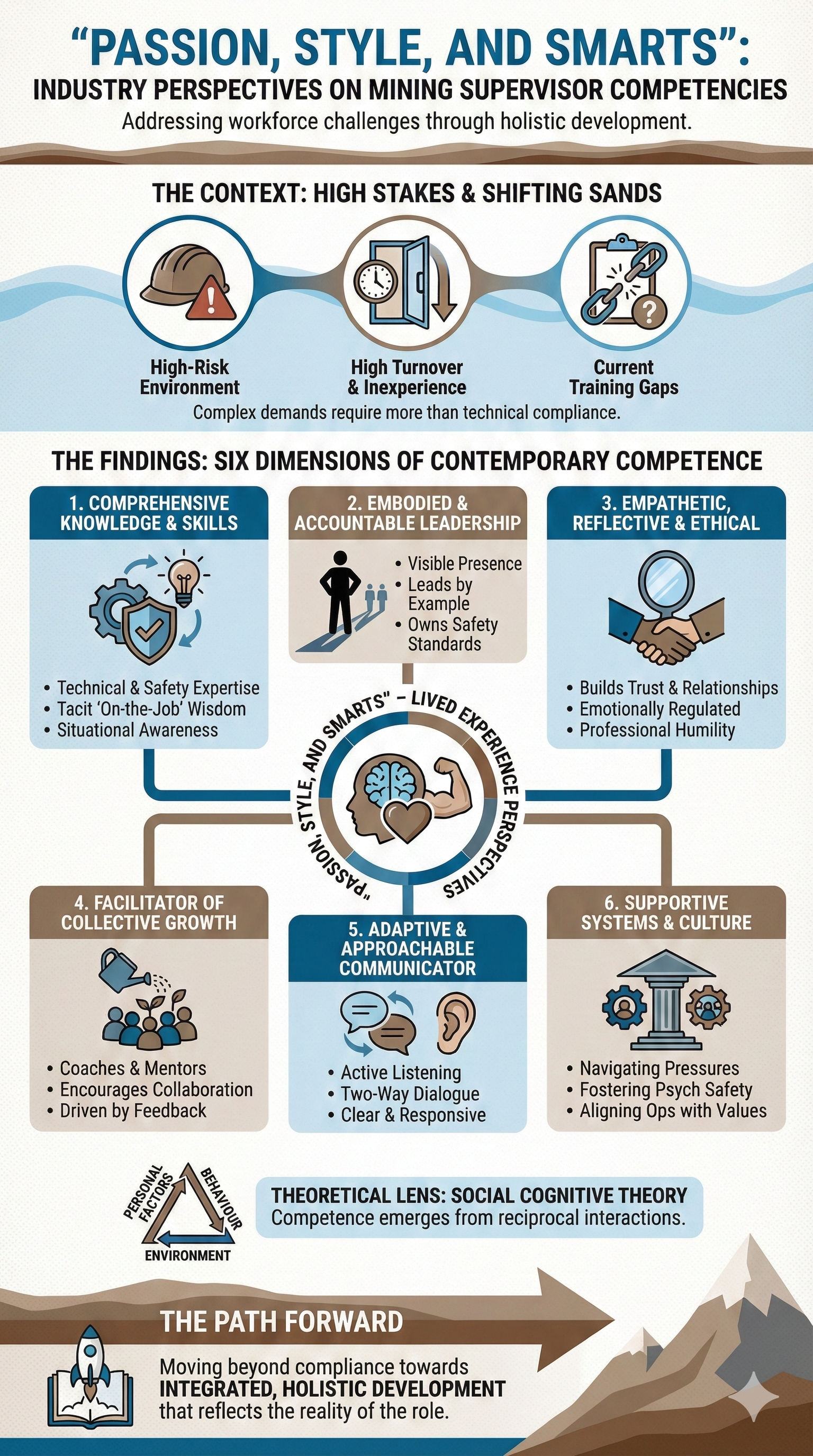
Mining Supervisor Competencies infographic

Mining Supervisor Competencies

Industry perspectives on holistic workforce development beyond technical compliance.

Create Your Own

Turn any research paper into a visual summary

+

These infographics were created using Nano Banana Pro, Google DeepMind’s new image-generation and editing model built on Gemini 3 Pro. It produces accurate, high-quality visuals with legible text across multiple languages. Here’s how to create your own research summary:

1
Upload your paper — Paste in or upload your paper. Nano Banana Pro works best with the abstract and key findings sections.
2
Use this prompt — Copy and adapt the prompt below to guide the AI.
3
Iterate and refine — Adjust colours, layout, and text density to suit your audience.
Example Prompt
Create a research infographic summarising this paper. Structure it with: 1. A clear title and subtitle at the top 2. A brief "The Problem" or "Context" section 3. A visual representation of the methodology 4. Key findings with simple icons or diagrams 5. Practical implications or takeaways at the bottom Style guidelines: - Use a cohesive colour palette (2-3 main colours) - Keep text concise — bullet points over paragraphs - Include visual icons to break up text - Make the flow logical from top to bottom - Ensure it's readable at [insert desired size, e.g., A4/poster] The audience is [academics/practitioners/general public] so adjust the technical language accordingly.

Tip: After generating, you can ask Nano Banana Pro to adjust specific elements — "make the colours more muted", "add more white space", or "simplify the methodology diagram".